Close


Source: Interaction Design Foundation
Typography isn’t merely about fonts — it’s the heartbeat of visual storytelling. In cinema, every story starts long before the first word is said. The typography of a movie poster or opening credits gently guides the audience’s emotions, framing their expectations before a single scene unfolds.
From bold, cinematic typefaces to delicate handwritten scripts, typography is the invisible storyteller. It builds immersion, sets tone, and cements the audience’s frame of mind — often before the first frame rolls.
As a digital-first creative agency in Malaysia, Kingdom Digital views typography not merely as a visual element but as a storytelling tool — one that brands and marketers can learn from when crafting campaigns that connect emotionally and meaningfully.
Typography acts as emotional architecture. It tells audiences what to expect — whether a story will be whimsical, haunting, satirical, or heartfelt. It’s a subtle but powerful form of visual storytelling that shapes perception before a single scene unfolds.
Source: Web Designer Hub
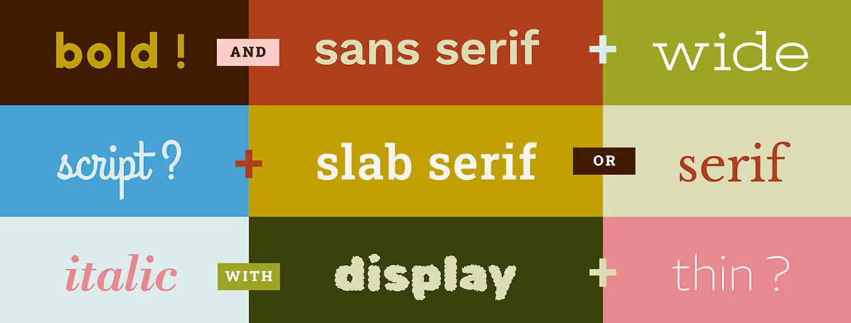
Display fonts, for instance, are bold, expressive, and unapologetic — demanding attention at first glance.
Case Studies:
🎬 Clueless: Its bubble-style lettering that signals a hyper-stylized, pop-culture satire.
🎬 Corpse Bride: The ornate, gothic title that invites audiences into a visually theatrical world tinged with melancholy and fantasy.
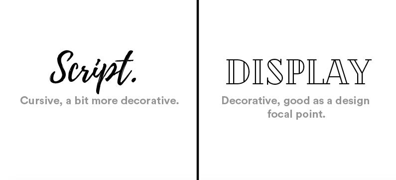
In contrast, Script fonts mimic human handwriting or calligraphy often carrying warmth and intimacy. They flow with emotion, lending authenticity and depth to the narrative.
Case Studies:
🎬 Moonrise Kingdom: Its handwritten title evokes nostalgia, innocence, and personal storytelling.
🎬 Priscilla: The soft, cursive typography signals a deeply personal narrative told from a quieter, more introspective perspective.
Typography isn’t passive — it frames perception. It tells us how to feel, what to expect, and what kind of world we’re about to enter.
Source: Netflix
Typography’s magic lies in its ability to be felt before it’s read. Every curve, stroke, and serif carries meaning. When executed with intention, typography doesn’t compete for attention; it aligns seamlessly with the emotional tone of the message. It’s the unsung hero of emotional design.
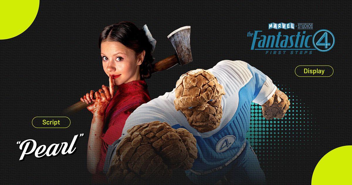
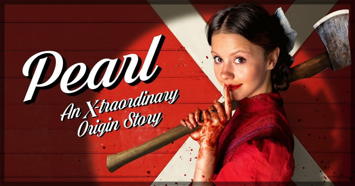
Take Pearl, for instance — its elegant, feminine lettering feels delicate, but beneath it lies a film about obsession and madness. The typography mirrors the duality of the protagonist, proving that great design doesn’t just communicate; it performs.
Typography’s power extends far beyond cinema. For marketers and creative teams, it’s a vital tool for shaping brand perception and emotional impact. The same principles that guide movie poster typography can elevate how brands express themselves across digital platforms.
Here are four creative lessons from film typography for branding through fonts:
• Fonts frame emotion. Typography sets the emotional tone before a word is even read.
• Consistency builds recognition. Cohesive font choices strengthen brand identity across campaigns.
• Emotion drives engagement. When typography feels right, audiences connect faster and remember longer.
• Typography is storytelling. It turns simple messages into experiences that resonate.
For creative agencies, embracing these principles leads to stronger brand narratives — transforming design into emotion, and emotion into loyalty.
Typography gives life to words. It transforms campaign key visuals into experiences and digital storytelling into something audiences can feel. In film, it sets the emotional stage; in branding, it builds lasting connections.
We believe that creativity made differently starts with intention — and typography is where that intention begins. It’s not just about what you say, but how your design makes people feel before they even read it.
When design meets emotion, and when brands think like storytellers, even the smallest details — like a typeface — can turn ordinary campaigns into unforgettable ones.
Ready to build a brand that speaks volumes at first glance? Let’s talk.
Interested in how typography powers storytelling in gaming? Read the first article here.


June 19, 2025
May 29, 2025
May 17, 2024
